


Hello everyone! I have started learning how to design webpages. Initially I used position and margin properties to align items in a particular place and make space among those items. Now I came to know about flexbox. Really it is very useful .Flexbox provides an efficient way to layout and align items and distribute the required space between the items in side the container. In this article I have made cheat sheet for flexbox. In flexbox layout there are some properties that can be applied to the container(parent) and some properties can be applied to the items(children) directly.
items can aligned based on 2 axis:
    - main axis (It is defined by "flex-direction" property.
                         For web pages main axis is row by default)
    - cross axis(opposite to the main axis).
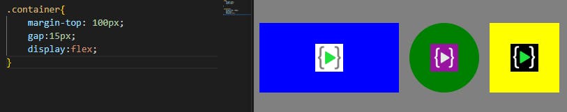
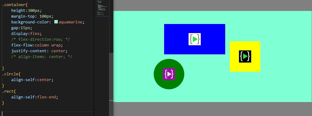
Properties: (can be applied to the container only) display: It will make the container flex box layout.
display:flex;
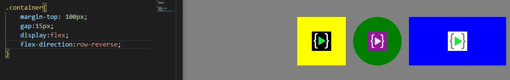
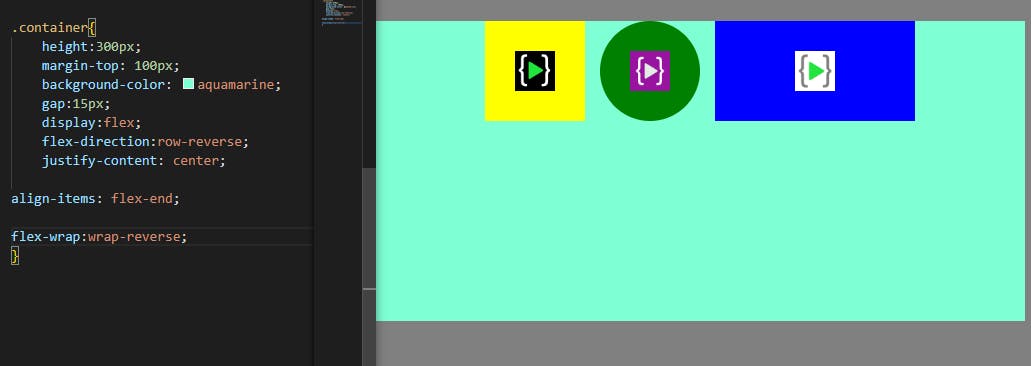
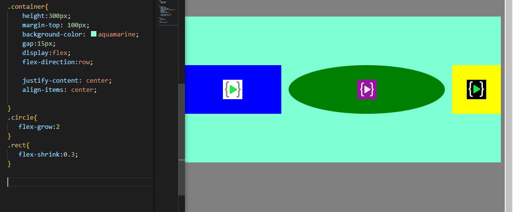
flex-direction: It will fix direction of main axis .
flex-direction: row/column/row-reverse/column-reverse
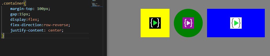
justify-content: It will work through the main axis. row-->left to right, row-reverse-->right to left, column-->top to bottom, column-reverse-->bottom to top.
          justify-content: flex-start/flex-end/center/space-between/
                                     space-around/space-evenly
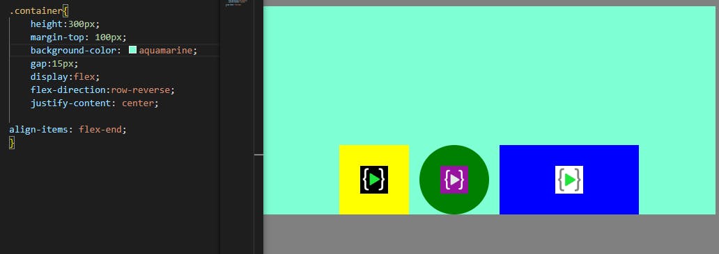
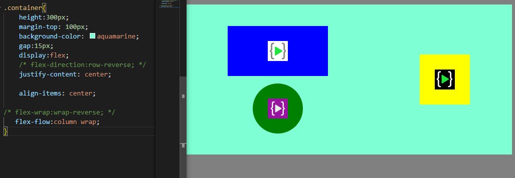
align-items: It will align items of container based on the cross axis.
align-items: flex-start/flex-end/center/stretch/baseline
flex-wrap: It allows the items to be in one single line or wrapped in multiple rows / columns
flex-wrap: nowrap/wrap/wrap-reverse
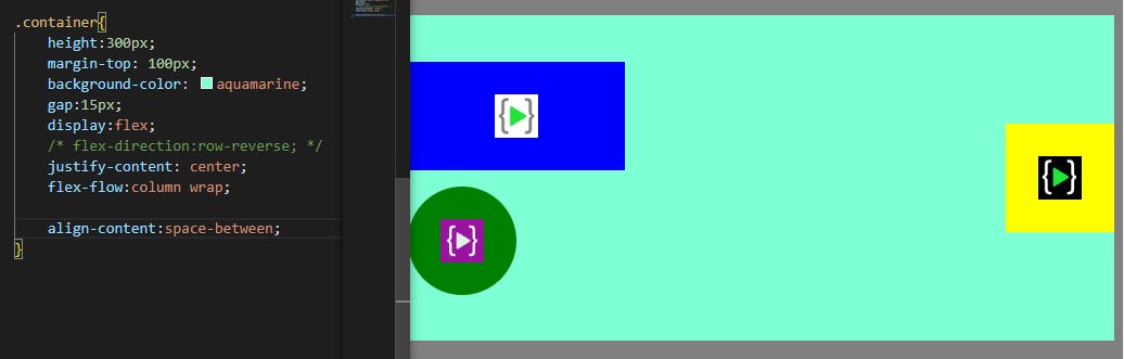
flex-flow: It is the combination of both flex-wrap and flex-direction
flex-flow: row wrap (flex-direction properties flex-wrap properties)
align-content: It distributes space between and around the wrapped items inside the container.
        align-content: flex-start/flex-end/center/stretch/space-between/
                                space-around/space-evenly
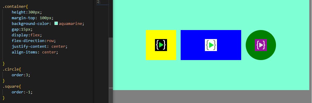
Properties :(can apply to the individual item)
order: It will decide the order of individual item. The items are sorted based on the ascending order value.
order: negative values/positive values
align-self: It will help individual items inside the container to be aligned
align-self: auto/flex-start/flex-end/center/stretch/baseline
flex-grow, flex-shrink: These properties will provide space for an item based on the ratio values.
      flex-grow: positive values
      flex-shrink: positive values
Thank you!!!!